In this post, you’ll learn how to use Angular Material calendar component without date picker input. The calendar component allows date selection in a month view, which could be useful for a wide range of use cases such as booking forms.
In addition to displaying a calendar, we will validate user input and highlight dates on the calendar.
Table of contents
Date picker component
Material docs have extensive documentation on the date picker component. This is a component that renders an input to let the user select a date from a calendar popup.
While this is useful in a data-entry form, it is not always the best way to get date value from the user. It is sometimes necessary to display a calendar that is always open.

As there isn’t an official Material component that works as a stand-alone calendar, I decided to take a deeper look at how the date picker works internally..
I discovered that the date picker brings along an additional component: mat-calendar. This is the component that the user sees on interaction with the date input.
Good news for us is that it is fully-functional with data binding and events.
Calendar component
Please follow the getting started guide, if this is your first time working with Material UI components.
Once that is done, it is possible to use the calendar by using mat-calendar selector:
<div class="calendar-wrapper">
    <mat-calendar #calendar [(selected)]="selectedDate">
    </mat-calendar>
</div>Code language: HTML, XML (xml)
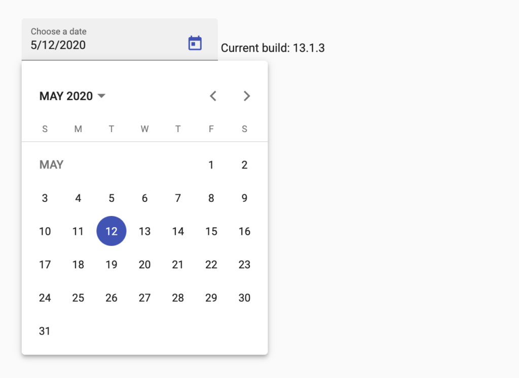
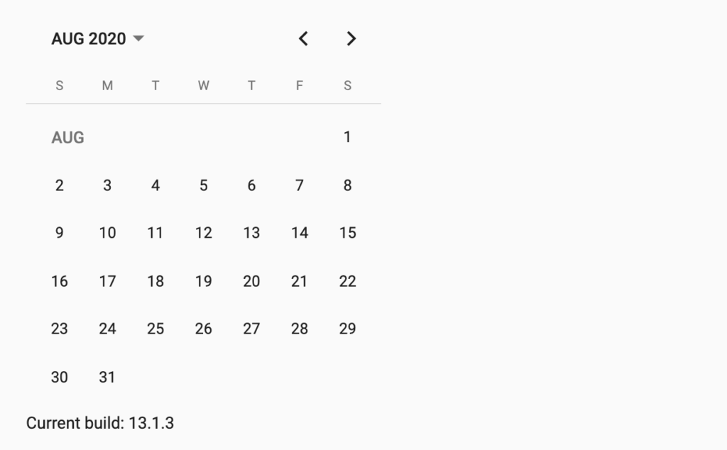
This will render the calendar component as below:

As the component has an id, ViewChild property decorator can access the calendar element:
 @ViewChild('calendar') calendar: MatCalendar<Moment>;
 selectedDate: Moment;Code language: TypeScript (typescript)
Calendar component events
As there is no documentation for this component, I had to figure things out myself.
It appears the calendar component has two events that we can listen to: selectedChange and monthSelected.
Event #1: selectedChange
This event fires when there is a change in date selection.
The event handler argument contains the wewly selected date object.
<mat-calendar #calendar [(selected)]="selectedDate"
              (selectedChange)="dateChanged($event)">
</mat-calendar>Code language: HTML, XML (xml)
dateChanged(date) {
alert(`Selected: ${date}`);
}Code language: JavaScript (javascript)Event #2: monthSelected
As the name suggests this event fires when the user changes the currently displayed month.
Similarly, the event argument contains the newly selected date object.
<mat-calendar #calendar [(selected)]="selectedDate"
              (monthSelected)="monthSelected($event)">
</mat-calendar>Code language: HTML, XML (xml)
monthSelected(date) {
alert(`Selected: ${date}`);
}Code language: JavaScript (javascript)Unfortunately, this event does not fire when the user interacts with arrow buttons.
If you need to access these button clicks, I recommend using the Renderer2 service for wiring-up event handlers. Renderer2 is a WebWorker safe way to manipulate DOM.
In this case, selected month can be extracted from the activeDate property.
ngAfterViewInit() {
  const buttons = document
   .querySelectorAll('.mat-calendar-previous-button, .mat-calendar-next-button');

  if (buttons) {
    Array.from(buttons).forEach(button => {
      this.renderer.listen(button, 'click', () => {
        alert('Arrow buttons clicked');
        // this.calendar.activeDate;
      });
    });
  }
}Code language: TypeScript (typescript)
How to validate date selection
While displaying a calendar is great, we need a way to validate input. It is not uncommon to validate selection in a calendar control, such as restricting selection to a date range.
The date picker allows us to set min and max dates for validation, which disables invalid dates in the calendar popup. How can we do the same in the calendar control?
Having looked at the source code for MatCalendar, it appears to have minDate and maxDate properties.
It turns out these properties also support data binding so we can implement calendar validation using regular typescript variables.
// from docs
export declare class MatCalendar<D> implements AfterContentInit, AfterViewChecked, OnDestroy, OnChanges {
    //......
    /** The minimum selectable date. */
    minDate: D | null;
    private _minDate;
    /** The maximum selectable date. */
    maxDate: D | null;
    private _maxDate;
    //.....
}Code language: TypeScript (typescript)
Here I am binding component variables to minDate and maxDate properties so that the calendar updates itself to limit the selectable date range:
<mat-calendar #calendar [minDate]="minDate" [maxDate]="maxDate"></mat-calendar>Code language: HTML, XML (xml)How to highlight dates on the calendar
Going beyond the simple input validation, you may be wondering how to highlight specific days on the calendar.

For example, a booking form with a calendar would highlight days that are available. This would draw the attention of the user to those dates.
We can use the Renderer2 service to manipulate the HTML output of the calendar component. This allows us to add and remove CSS classes and attributes.
  /**
   * Method to highlight certain days on the calendar.
   * This should be used when month selection changes.
   *
   * @param days: Array of strings in the format "February 20, 2020"
   */
  private highlightDays(days: string[]) {
    const dayElements = document.querySelectorAll(
      'mat-calendar .mat-calendar-table .mat-calendar-body-cell'
    );

    Array.from(dayElements).forEach((element) => {
      const matchingDay = days.find((d) => d === element.getAttribute('aria-label')) !== undefined;

      if (matchingDay) {
        this.renderer.addClass(element, 'available');
        this.renderer.setAttribute(element, 'title', 'Event 1');
      } else {
        this.renderer.removeClass(element, 'available');
        this.renderer.removeAttribute(element, 'title');
      }
    });
  }Code language: TypeScript (typescript)
Detailed explanation of how the method above works:
- Retrieve all HTML elements that represent a day in current month view
- Filter out the days we are not interested in, by checking the value of
aria-label- The aria label contains the date in specific format: March 20, 2019
- Add a custom CSS class
availableto highlight a day
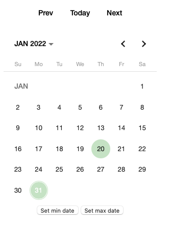
For the purpose of this demo, we can just use a hand-crafted array of dates to highlight couple of days in January 2022. If you need to get these dates from a backend service, you may need to find the current month and year visible on the calendar:
//// Get current month/year selected in calendar to facilitate backend call
const month = parseInt(this.calendar.activeDate.format('M'));
const year = parseInt(this.calendar.activeDate.format('Y'));
this.backendService.getAvailableDays(month, year); // Expected format: ["February 20, 2020"]Code language: TypeScript (typescript)
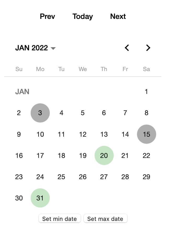
Finally, we just need to add styles to actually highlight the days:
::ng-deep .available .mat-calendar-body-cell-content{
    background-color: rgba(14, 152, 5, 0.25);
}Code language: CSS (css)
::ng-deep is necessary if you are not using the main styles.css of your Angular application.
How to disable dates on the calendar
Several readers have asked how to disable dates on the calendar component.

Following a similar approach to highlighting days, we can disable days using the Renderer2 service.
  /**
   * Method to disable certain days on the calendar.
   * This should be used when month selection changes.
   *
   * @param days: Array of strings in the format "February 20, 2020"
   */
  private disableDays(days: string[]) {
    const dayElements = document.querySelectorAll(
      'mat-calendar .mat-calendar-table .mat-calendar-body-cell'
    );

    Array.from(dayElements).forEach((element) => {
      const matchingDay = days.find((d) => d === element.getAttribute('aria-label')) !== undefined;

      if (matchingDay) {
        this.renderer.setAttribute(element, 'disabled', '');
        this.renderer.setAttribute(element, 'title', 'Unavailable');
      } else {
        this.renderer.removeAttribute(element, 'disabled');
        this.renderer.removeAttribute(element, 'title');
      }
    });
  }Code language: JavaScript (javascript)
Again, we go through the HTML elements of the calendar and add disabled attribute to days we want to disable.
As each day in the calendar is actually a td element (not a button!), the disabled attribute has no effect on its own..
CSS can help us here. Using pointer-events, we disable the click event.
Also, let’s add a background-color to make disabled days more prominent.
::ng-deep .mat-calendar-body-cell[disabled]{
    pointer-events: none;
}
::ng-deep .mat-calendar-body-cell[disabled] .mat-calendar-body-cell-content {
    background-color: rgba(128, 128, 128, 0.637);
}Code language: CSS (css)
Custom Angular Material calendar component
Since we’re likely to add custom functionality around the calendar component, it makes a lot of sense to create a reusable component for it.
Generate a new component called Calendar. If your application has a shared module, the calendar should be placed there as you’re likely to use it across feature modules.
ng generate component CalendarCode language: Bash (bash)Add the necessary HTML markup of the mat-calendar component in the template:
<div class="calendar-wrapper">
  <button mat-button (click)="prevDay()">Prev</button>
  <button mat-button (click)="today()">Today</button>
  <button mat-button (click)="nextDay()">Next</button>

  <mat-calendar #calendar [minDate]="minDate" [maxDate]="maxDate" (monthSelected)="monthChanged($event)" [(selected)]="selectedDate"
    (selectedChange)="dateChanged()"></mat-calendar>

  <button (click)="setMinDate()">Set min date</button>
  <button (click)="setMaxDate()">Set max date</button>
</div>Code language: HTML, XML (xml)
I have added buttons above the calendar to demonstrate two-way binding. These buttons will set the current date of the calendar to previous day, today or next day.
Let’s also add some styling so that the calendar does not take up the full width of the page:
.calendar-wrapper {
    width: 300px;
    text-align: center;
}Code language: CSS (css)
Implement the calendar in the component as shown below.
import * as moment from 'moment';

import {
    AfterViewInit, Component, EventEmitter, Output, Renderer2, ViewChild
} from '@angular/core';
import { MatCalendar } from '@angular/material';

@Component({
  selector: 'app-calendar',
  templateUrl: './calendar.component.html',
  styleUrls: ['./calendar.component.css']
})
export class CalendarComponent implements AfterViewInit {
  selectedDate = moment();
  minDate: moment.Moment;
  maxDate: moment.Moment;

  @Output()
  dateSelected: EventEmitter<moment.Moment> = new EventEmitter();

  @Output()
  monthSelected: EventEmitter<moment.Moment> = new EventEmitter();

  @ViewChild('calendar', { static: true })
  calendar: MatCalendar<moment.Moment>;

  constructor(private renderer: Renderer2) { }

  setMinDate() {
    this.minDate = moment().add(-10, 'day');
  }

  setMaxDate() {
    this.maxDate = moment().add(10, 'day');
  }

  ngAfterViewInit() {
    this.setupArrowButtonListeners();
  }

  private setupArrowButtonListeners() {
    const buttons = document.querySelectorAll('.mat-calendar-previous-button, .mat-calendar-next-button');

    if (buttons) {
      Array.from(buttons).forEach(button => {
        this.renderer.listen(button, 'click', () => {
          this.monthSelected.emit(this.calendar.activeDate);
        });
      });
    }
  }

  monthChanged(date: moment.Moment) {
    this.monthSelected.emit(date);
  }

  dateChanged() {
    this.calendar.activeDate = this.selectedDate;
    this.dateSelected.emit(this.selectedDate);
  }

  prevDay() {
    const prevMoment = moment(this.selectedDate).add(-1, 'days');
    this.selectedDate = prevMoment;
    this.dateChanged();
  }

  today() {
    this.selectedDate = moment();
    this.dateChanged();
  }

  nextDay() {
    const nextMoment = moment(this.selectedDate).add(1, 'days');
    this.selectedDate = nextMoment;
    this.dateChanged();
  }
}Code language: TypeScript (typescript)
The component is pretty simple – we’ve put together a component that exposes a dateSelected event that fires whenever the selected date changes.
Here is how to use the calendar component:
<app-calendar (dateSelected)="dateSelected($event)" (monthSelected)="monthSelected($event)"></app-calendar>Code language: HTML, XML (xml)import { Moment } from 'moment';
import { Component } from '@angular/core';
@Component({
selector: 'app-root',
templateUrl: './app.component.html'
})
export class AppComponent {
dateSelected(value: Moment) {
alert(value);
}
monthSelected(value: Moment) {
alert(value);
}
}Code language: TypeScript (typescript)Summary
In this post, we got our hands dirty with the Angular Material calendar component. I have been using this in a real-world application for quite some time and haven’t had any issues yet. While the component is very helpful, I am not sure why the documentation does not mention it. If you know the answer, drop a comment below!


Believe it or not, this is the only sensible article on that matter (still, in 2022!), but I have a question fundamental to me- how on Earth I can connect calendar value to an input?! I mean… it’s simple as assigning ngModel, but I want it formatted and behaving like an input with matDatepicker assigned…
muchas gracias 🙂
Hi Umut,
two questions…
How apply filter and…
How open auto the calendar
Thanks
Hi thank you. Is there a way someone can select time as well?
Hi Umut,
This article has helped me a lot, thanks for that. Could you please suggest how can I change the background colour of all dates depending on some criteria or event. Also, can any other view be called in the on click event of this calendar.
Thanks
Very usefull, thx.
Hi Umut, any idea how i can re render the calendar?
For example, I choose two dates to set as min and max values for filtering, and then when I press a button I want the calendar to re render so it can have the filter applied.
Hi, there should be no need to re-render the calendar component as it works with two-way binding. So in the calendar component:
[minDate]="minDate" [maxDate]="maxDate"Here is a working example based on the tutorial code. Good luck!
Hi Umut, could I use this component to show an event. I mean, could I show a red dot on November 1st lets say to indicate an event?
Hi Jesse,
I have updated the post to include a section on how to highlight dates on the calendar. You can use it as a starting point.
Thanks
Umut
Hi Umut, how can I select the range of dates in calendar
Unfortunately this is not supported out of the box, you could wrap the calendar in a component and allow selection of multiple dates via input/output events. You’d need to heavily work with DOM though, which may be a pain in the neck. If you choose to do this, make sure to use
Renderer2to query and modify elements in the DOMHi Umut, Is there a way to gray-out certain days on the calendar? I wanted to try to use it like an activity calendar with a modal that appears on click to show the details of the day that was clicked. Then for the days that there are no activities, I want the day to be grayed-out and disabled from clicks.
The modal is in place, but right now it’s the same for every day that’s clicked.
Hi Jessica,
Yes, this is easy to achieve in
ngAfterViewInithook. I have updated the post to include a section for disabling dates on the calendar.Many thanks
Umut
Thank you for the article. But the problem with this calendar is it doesn’t have two-way data bindings. If you change selectedDate value in App component after the calendar was rendered already – you won’t see any changes in the calendar. Unfortunately, I didn’t find a way how to fix it.
Hi Iar, thank you for your comment. I have updated the post to demonstrate two-way binding. Hope this helps.
It’s very helpful @Umut Esen … I couldn’t find a way to show multi-month view. Can you please let me know the solution for that.
Thank you for your comment. Unfortunately, multi-month view is not supported. See https://github.com/angular/components/issues/14586
Great article Umut. Thanks for sharing. Any idea how to set min / max selection date and disable calendar?
I would consider creating a wrapper component, which would be used as a generic calendar. This wrapper component would accept min/max date values through input parameters. All you would have to do then is to perform min/max validation inside onDateChanged event.
A great article! Thank you!