
It is a common requirement for any Angular application to prompt the user for a confirmation dialog. For instance, you may want to show a message when the user wants to delete a record or send an email. In this post, we will look at how we can implement a reusable component in Angular Material components.
Table of contents
Basic confirm dialog in JavaScript
Traditionally, web applications make use of the built-in JavaScript API to show confirm dialog as shown below.
However, the vanilla JavaScript dialogs are synchronous – meaning everything on the screen will freeze until the user responds, they can’t be customised visually and don’t support images.
// Display a confirmation prompt
var result = confirm("Are you sure?");Code language: JavaScript (javascript)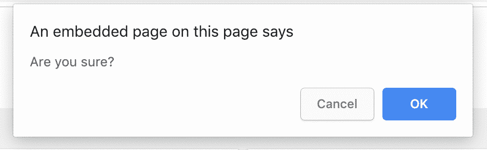
Angular Material confirm dialog
To overcome the limitations of the traditional approach, we can easily build a flexible confirmation dialog in Angular with a bit of help from the Material components.
Here is what we are going to build:
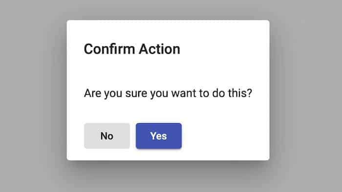
We will use the Dialog component of Angular Material library to display our confirm dialogs.
The dialog takes the focus away from the current window, and forces the browser to read the message. The following are the main features of this custom component:
- Asynchronous Behaviour: We want to show the dialog and subscribe to its result. This is very important as we don’t know when the user is going to respond. Asynchrony allows us to properly react to the response of the user.
- Flexibility: We want to customise the title & message of the confirm dialog so that we can display any message from anywhere in the application.
Check out the code on GitHub or view live demo here.
Import Angular Material components
First of all, you need to import Angular Material to your application. If you need help with this, check out my guide.
Once you have access to Material components, import ButtonModule and MatDialogModule.
import { NgModule } from '@angular/core';
import { MatButtonModule, MatDialogModule } from '@angular/material';

@NgModule({
  imports: [
    MatButtonModule, MatDialogModule
  ],
  exports: [
    MatButtonModule, MatDialogModule
  ]
})
export class CustomMaterialModule {}Code language: TypeScript (typescript)
I am importing Material UI components to a feature module called CustomMaterialModule.
You can import them directly to the app.module.
Generate a component
Next, generate a component for the confirmation dialog using the following command:
ng generate component ConfirmDialogCode language: Bash (bash)This will automagically create your component and link it with your root app.module.
Open the app.module and add the newly-created component to the entryComponents array. This is so that the confirm dialog can be dynamically loaded into the view – read more about entry components.
import { BrowserModule } from '@angular/platform-browser';
import { BrowserAnimationsModule } from '@angular/platform-browser/animations';
import { NgModule } from '@angular/core';
import { AppComponent } from './app.component';
import { CustomMaterialModule } from './custom-material/custom-material.module';
import { ConfirmDialogComponent } from './confirm-dialog/confirm-dialog.component';

@NgModule({
  declarations: [
    AppComponent,
    ConfirmDialogComponent
  ],
  imports: [
    BrowserModule,
    BrowserAnimationsModule,
    CustomMaterialModule
  ],
  providers: [],
  entryComponents: [ConfirmDialogComponent],
  bootstrap: [AppComponent]
})
export class AppModule {}Code language: TypeScript (typescript)
Implement dialog features
Basically, we just want to show a heading, message and buttons to dismiss the dialog.
Here is what the template looks like:
<h1 mat-dialog-title>
  {{title}}
</h1>

<div mat-dialog-content>
  <p>{{message}}</p>
</div>

<div mat-dialog-actions>
  <button mat-button (click)="onDismiss()">No</button>
  <button mat-raised-button color="primary" (click)="onConfirm()">Yes</button>
</div>Code language: HTML, XML (xml)
As you can see, this is a standard Material dialog implementation.
The component class to handle UI interaction is as follows:
import { MatDialogRef, MAT_DIALOG_DATA } from '@angular/material';
import { Component, OnInit, Inject } from '@angular/core';

@Component({
  selector: 'app-confirm-dialog',
  templateUrl: './confirm-dialog.component.html',
  styleUrls: ['./confirm-dialog.component.css']
})
export class ConfirmDialogComponent {
  title: string;
  message: string;

  constructor(public dialogRef: MatDialogRef<ConfirmDialogComponent>,
    @Inject(MAT_DIALOG_DATA) public data: ConfirmDialogModel) {
    // Update view with given values
    this.title = data.title;
    this.message = data.message;
  }

  onConfirm(): void {
    // Close the dialog, return true
    this.dialogRef.close(true);
  }

  onDismiss(): void {
    // Close the dialog, return false
    this.dialogRef.close(false);
  }
}

/**
 * Class to represent confirm dialog model.
 *
 * It has been kept here to keep it as part of shared component.
 */
export class ConfirmDialogModel {

  constructor(public title: string, public message: string) {
  }
}Code language: TypeScript (typescript)
The component just handles the events by closing the Material dialog with the selected result from the view.
ConfirmDialogModel is used to pass data into the dialog.
Display dialog on button click
Finally, we can show our custom confirmation dialog using the code below.
Since we use MatDialog component internally, we take in the MatDialog dependency in the constructor and show the confirm dialog on button click.
Subscribing to the afterClosed() event of the dialog means that we can get the result and update the view through data-binding.
Add a button to the view to trigger the dialog, and a label to show the response:
<button mat-raised-button color="primary" (click)="confirmDialog()">Confirm</button>
<br>
Response is: {{result}}Code language: HTML, XML (xml)
and the component for the functionality:
import { Component } from '@angular/core';
import { ConfirmDialogModel, ConfirmDialogComponent } from './confirm-dialog/confirm-dialog.component';
import { MatDialog } from '@angular/material';

@Component({
  selector: 'app-root',
  templateUrl: './app.component.html'
})
export class AppComponent {
  result: string = '';

  constructor(public dialog: MatDialog) {}

  confirmDialog(): void {
    const message = `Are you sure you want to do this?`;

    const dialogData = new ConfirmDialogModel("Confirm Action", message);

    const dialogRef = this.dialog.open(ConfirmDialogComponent, {
      maxWidth: "400px",
      data: dialogData
    });

    dialogRef.afterClosed().subscribe(dialogResult => {
      this.result = dialogResult;
    });
  }
}Code language: TypeScript (typescript)
Summary
In conclusion, we looked at how we can create a reusable component in Angular to display confirmation dialogs. Similarly, this approach can be used to implement other types of dialogs such as alerts, date/time input dialogs & more.
Check out the code on GitHub.


Seeing an error in stackblitz on the example code in this article:
Error in /~/src/app/confirm-dialog/confirm-dialog.component.ts (44:156)
Cannot access ‘ConfirmDialogModel’ before initialization
This error occurs randomly, have been unable to determine the cause.
Thank you for your message, I have tried to replicate the issue but stackblitz seems to be working ok. Please try downloading the source code.
Instead of injecting MatDialog into your component you could create a service that provides the confirmDialog method to create and open the modal and a behavior subject result value that can be subscribed to from your componet.
export class ConfirmDialogService {
result$ = new BehavoirSubject(false);
constructor(public dialog: MatDialog){}
confirmDialog(title: string, message:string) {
…
dialogRef.afterClosed().subscribe(res => this.result$.next(res));
}
Nice article. Keep it up. Just a question – For different events, I don’t want to create different components rather want to have a single component which can have all the dialogs content. How can I achieve this?
Hi there! The `ConfirmDialogModel` class demonstrated in the article can transfer pretty much any kind of content, including complex objects, to the dialog. You can declare new properties in that class and render the contents in the shared dialog html. Depending on the complexity of your events, you may want to consider rendering components in the dialog via routing. Good luck!
Like!! Great article post.Really thank you! Really Cool.
how did you said that this is reusable.
Hi bablu, the component is re-usable in the sense that it can be placed in a shared module and used in any other module. You could also package it up as an npm package to include in different projects.
Thanks a lot !
I really needed this. works PERFECTLY!
THANKS