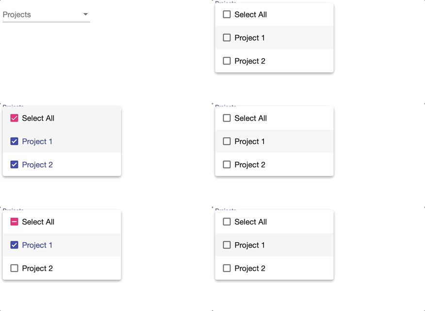
In this post, you’ll learn how to implement select all option for mat-select from Angular Material.
Our solution will involve creating a custom component that will be embedded inside a select dropdown. It will also support indeterminate mode of checkbox, meaning our new option will show a different icon based on selected options.

Table of contents
Why do you need a select all option?
Angular Material select component has a multi-select feature, which allows users to check multiple options. Unfortunately, there is no way to display select all option out-of-the-box.
I can sometimes be useful to select/deselect all options in mat-select dropdown when there are several options. For example, a user may want to select all Projects in a dropdown. Instead of clicking one by one, they can save time by clicking a single option.
Therefore, we can build a re-usable select all option to make our users life easier!
Step #1: Create a component for select all option
Firstly, let’s generate a new component to make the select all logic reusable:
ng generate component select-check-allCode language: Bash (bash)Then, place a mat-checkbox inside the component template. This is the Select all option.
<mat-checkbox class="mat-option" [indeterminate]="isIndeterminate()"
[checked]="isChecked()" (click)="$event.stopPropagation()"
    (change)="toggleSelection($event)">
  {{text}}
</mat-checkbox>Code language: HTML, XML (xml)
After that, set the CSS class to mat-option so that its styling is consistent with other options in mat-select.
Using data-binding, we update the indeterminate and checked state of the checkbox. This is important to show an icon representing the state of the mat-select.
Moreover, the checkbox needs to have access to the mat-select. Using reactive forms, we will pass in the form control and the list of values to the checkbox.
Let’s take a look at the component implementation:
import { Component, Input, ViewEncapsulation } from '@angular/core';
import { FormControl } from '@angular/forms';
import { MatCheckboxChange } from '@angular/material';

@Component({
  selector: 'app-select-check-all',
  templateUrl: "./select-check-all.component.html",
  styleUrls: ['./select-check-all.component.css'],
  encapsulation: ViewEncapsulation.None
})
export class SelectCheckAllComponent {
  @Input() model: FormControl;
  @Input() values = [];
  @Input() text = 'Select All';

  isChecked(): boolean {
    return this.model.value && this.values.length
      && this.model.value.length === this.values.length;
  }

  isIndeterminate(): boolean {
    return this.model.value && this.values.length && this.model.value.length && this.model.value.length < this.values.length;
  }

  toggleSelection(change: MatCheckboxChange): void {
    if (change.checked) {
      this.model.setValue(this.values);
    } else {
      this.model.setValue([]);
    }
  }
}
Code language: TypeScript (typescript)
Notice we use @Input variables to pass the form control, selectable values and display text.
Finally, add the following styles so that the checkbox takes up full width.
app-select-check-all .mat-checkbox-layout,
app-select-check-all .mat-checkbox-label {
  width:100% !important;
}Code language: CSS (css)
Step #2: Embed custom component in a mat-select
At last, we can use the custom component to select all options within a mat-select.
Start by creating a form and add a mat-select with multiple selection.
Above the loop for generating options, add the app-select-check-all component. This way, our custom component will appear as the first item in the list.
Don’t forget to pass in the form control value and the full list of values into app-select-check-all component.
<form [formGroup]="form">
	<mat-form-field class="full-width">
		<mat-select placeholder="Projects" formControlName="project" multiple>
			<app-select-check-all [model]="form.get('project')" [values]="projects">
			</app-select-check-all>
			<mat-option *ngFor="let project of projects" [value]="project">{{ project.name }}</mat-option>
		</mat-select>
	</mat-form-field>
</form>Code language: HTML, XML (xml)
import { Component } from '@angular/core';
import { FormGroup, FormControl } from "@angular/forms";
import { Project } from "./project";
@Component({
selector: 'app-root',
templateUrl: './app.component.html'
})
export class AppComponent {
projects:Project[];
form: FormGroup;
constructor() {
// Create sample projects
this.projects = [
new Project("Project 1"),
new Project("Project 2")
]
// Setup form
this.form = new FormGroup({
project: new FormControl(this.projects)
});
}
}Code language: TypeScript (typescript)Live demo
Here is a stackblitz project demonstrating select all option for mat-select:
Summary
In conclusion, you learned how to select all options in Angular Material Select with a custom checkbox component. This custom behaviour provides a way for user to quickly select all options.
Did you find this useful? Let me know in the comments below!


thanks you so much for giving me lot of hints
Thanks mate!! Saved me big time, I can now spend the rest of this sunny Sunday with my kids, and that’s the difference you just made 🙂
Hi,
Thank you so much for your effort. I’ve implemented your code and made some tweaks. However, I’m facing some problems. It can be produced as, at least 8 tags should be there and when you press on an item in the dropdown, dropdown scrolls down one element. I’m wondering if this is because of the component tag. Could you please look into it, what could be the problem.
Thanks
Thanks for your comment! If you could put an example on github/stackblitz, I can take a look.